
NOIR 2.0 drains colour, bringing life to the cinematography of contemporary films re-imagining them in glorious BLACK & WHITE.

The cinematography of the classic film noirs influenced generations of filmmakers. The restricted camera movement and lack of colour to emphasize themes forced artists to craft provocative compositions to elicit emotions and heighten the tension. The craft is still alive! Today, directors embellish camera angles and lightning to create atmosphere and help absorb us into their vision.

Fellow movie nerds may recall MAD MAX: FURY ROAD helmer, George Miller, recently unleashed his film in Black & White Chrome to shine on a spotlight on the cinematography. While we can do this at home with any movie, by adjusting the colour settings on our television, the deliberate adjustment of brightness and contrast levels by the director would also further enhance Miller’s vision (for example).
This photographic series aims to remind the audience how certain blockbusters respect the art while delivering on the popcorn.
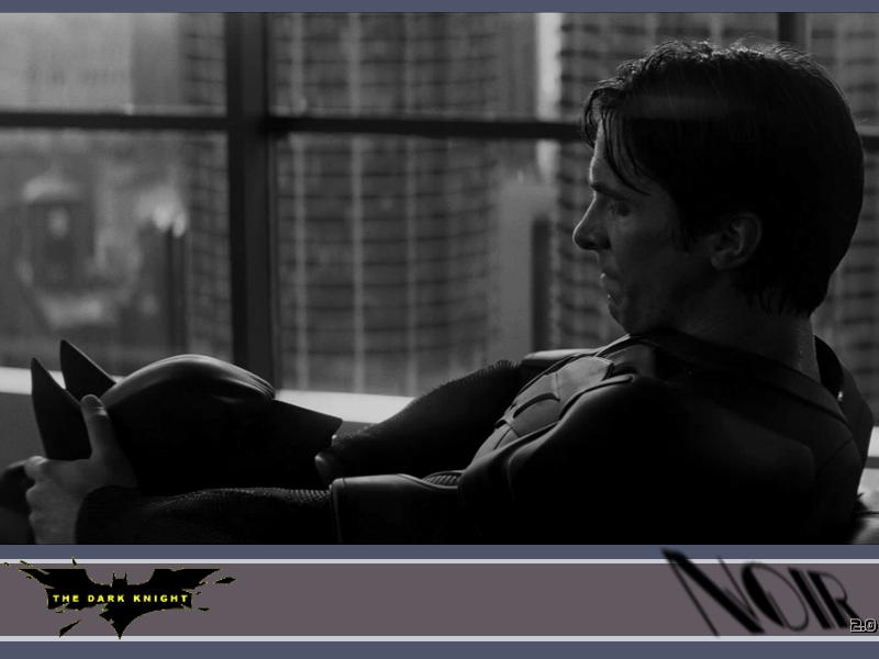
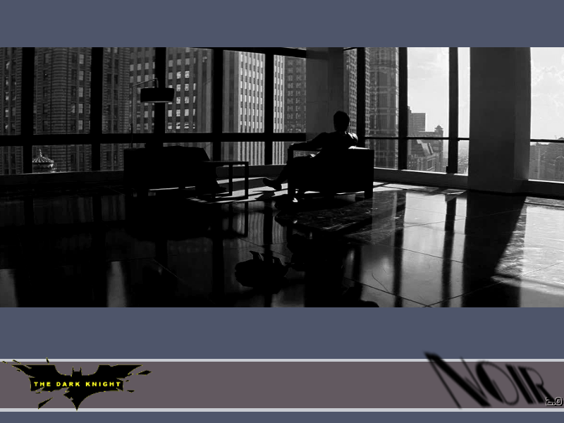
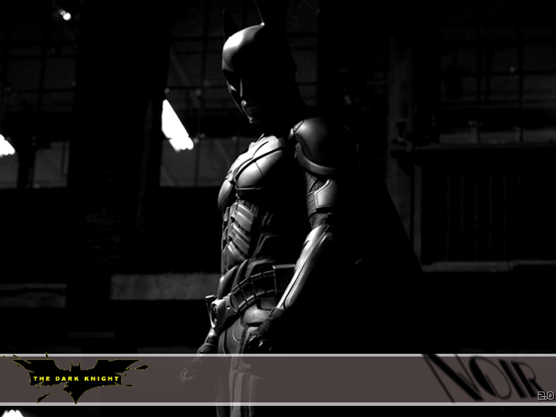
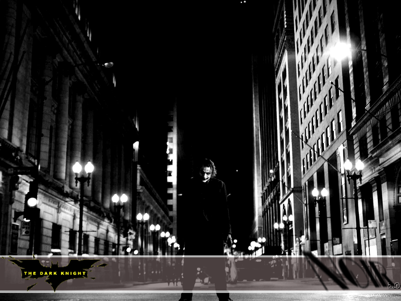 NOIR: VOLUME 1 launches by highlighting one of the best superhero movies of all-time… arguably the best… THE DARK KNIGHT (2008). Director Christopher Nolan is a massive cinephile, embracing the opportunity to tell visual stories on film (ie: celluloid, not digital).


To demonstrate how different our favourite movies would look if they were shot in Black & White, BATMAN was a logical beginning. THE DARK KNIGHT is the perfect blend of art and popcorn.
Let’s dig in.
Chime in and leave a comment about what movies you’d like to see get the NOIR treatment next.
THE DARK KNIGHT


What do you think?

stylized alternative – Frank Miller style 😉
Leave a comment below or TWEET me @slipthroughnerd 
Is DARK KNIGHT worth watching in NOIR? Any favourite images?
 More Images Coming Soon in Part 2!


I’d be interested to see how The Avengers looks in black and white. Those colours pop in that film so would be interesting to see if it still pops. I enjoyed the shot of the Joker on the street both in colour and black and white. Cool stuff.
LikeLike
I like it. Those images look great. Not too fond of the Frank Miller style though. His stuff just never really clicked with me. Looking forward to seeing what’s coming up.
LikeLiked by 1 person
Yes! I’m glad you liked the B&W images. I was hoping for your nerd-certified stamp of approval 🙂 Any requests on what film should get the NOIR treatment next? I’m thinking old school horror, like maybe Mario Bava or Dario Argento.
LikeLiked by 1 person
I’m not sure really. Maybe one of the recent Bond films. Anything would be cool.
LikeLiked by 1 person
Great idea. The Daniel Craig flicks definitely have some good cinematography. Thanks for the pick! Stay tuned for some Bond 🙂
LikeLiked by 1 person
I like it! I liked the sharp silloutte of Batman’s costume among the beams. The lines are so pronounced. And the make up on the Joker’s face is scarier in b/w. Cool post.
LikeLiked by 1 person
Right on! Thanks for stopping by, Cindy. Glad you appreciate the Noir treatment. I love the contrast in B&W too. There is a stark beauty to the way it all ‘pops’. I played around with lighting in all of the images, and compositions in some, to (hopefully) make images more striking. The next Volume of Noir will have a less obvious choice to turn B&W. Any suggestions/requests? I know you have an eye for composition with your own impressive photography.
LikeLike
V for Vendetta 😉
LikeLike
WOW! Excellent choice. Great compositions and lighting in that cult classic. I think that film was directed by the Wachowski’s DOP. Thanks for the pick!
LikeLiked by 1 person
My pleasure, Dan. 🙂
LikeLiked by 1 person
Appreciate it! Just posted NOIR: V FOR VENDETTA. Astounding pick! I gave you a shout-out in the article. I hope you like some of the compositions and high contrast lighting I messed around with 🙂
LikeLiked by 1 person